Direct
-
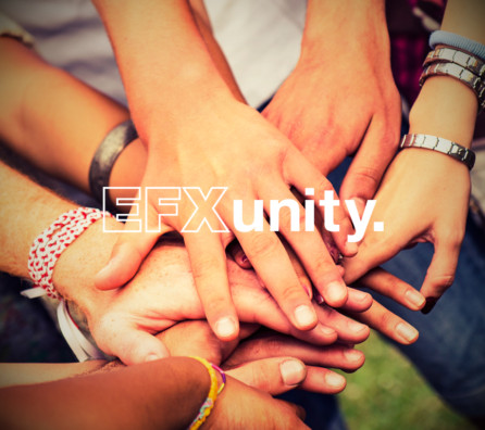
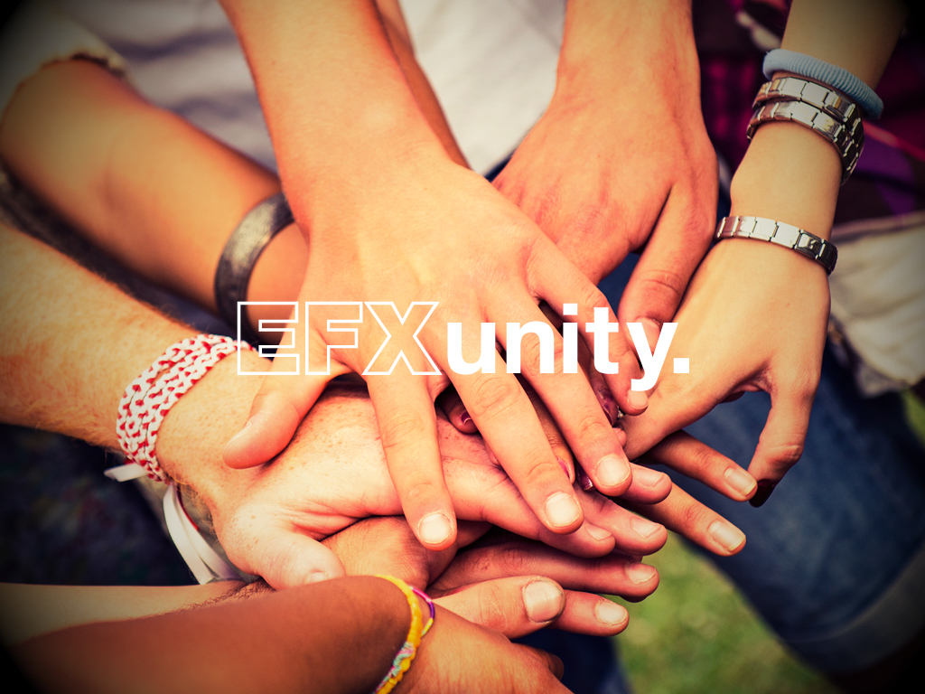
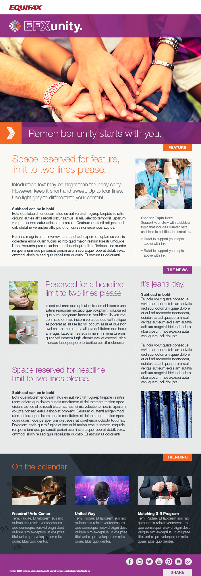
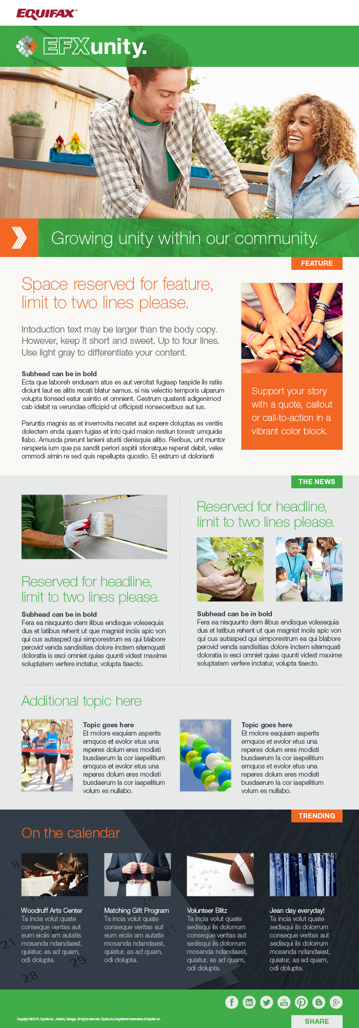
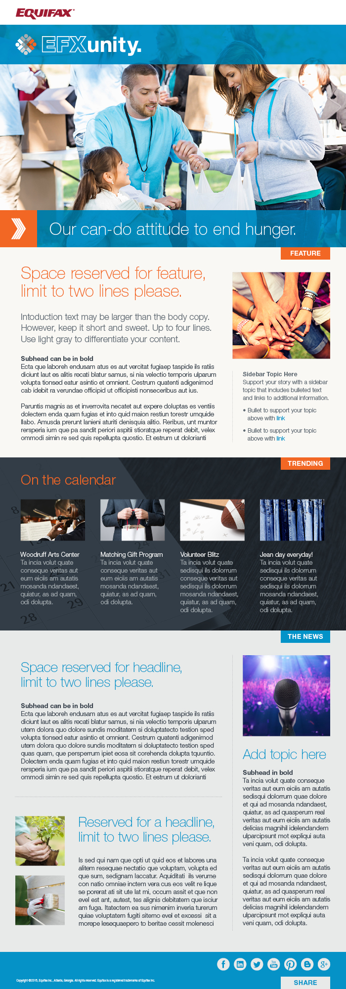
Unity Newsletter
In an effort to bring more visability to the Community Affairs group and social responsibility programs within the organization, the first-ever Unity newsletter was born. The samples shown emphasize the modular and adaptable structure optimized for digital space. These files served as the basis for further issue creation and were mainly released as interactive PDFs with working links and often supporting secondary content pages. This project was so well received that it expanded our offering and allowed us to also create the first-ever interactive social responsibility report for the company. Role Included: System Concept, Design and Production Design of multiple...
more -
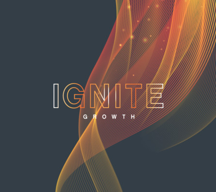
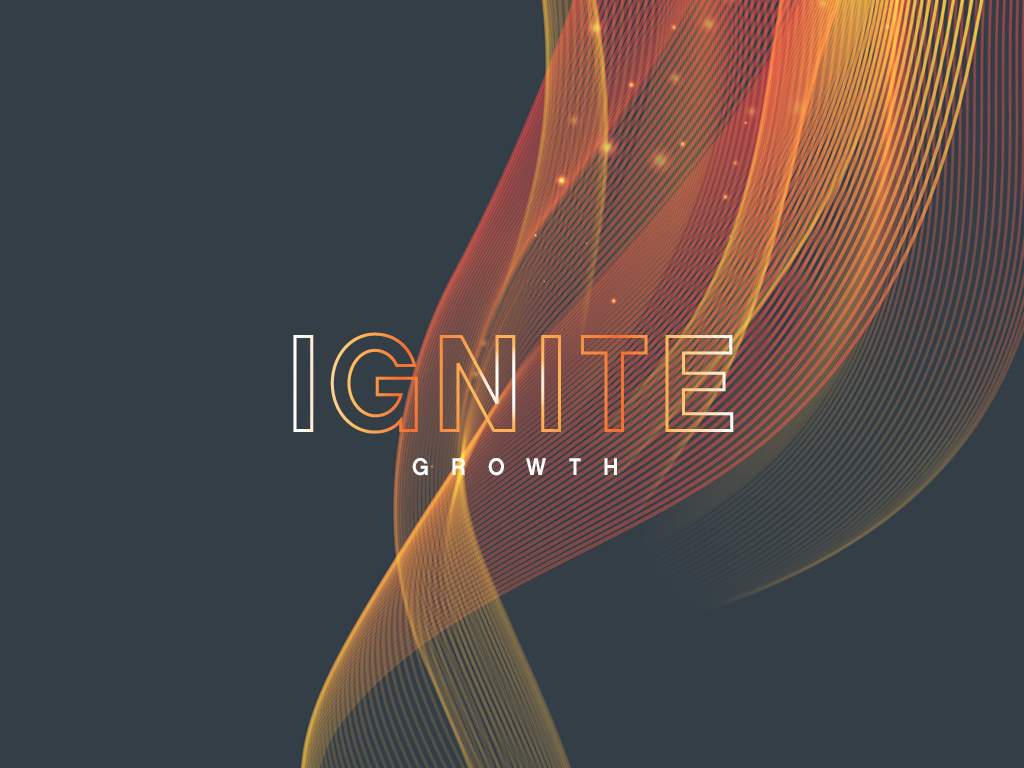
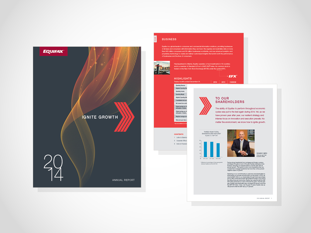
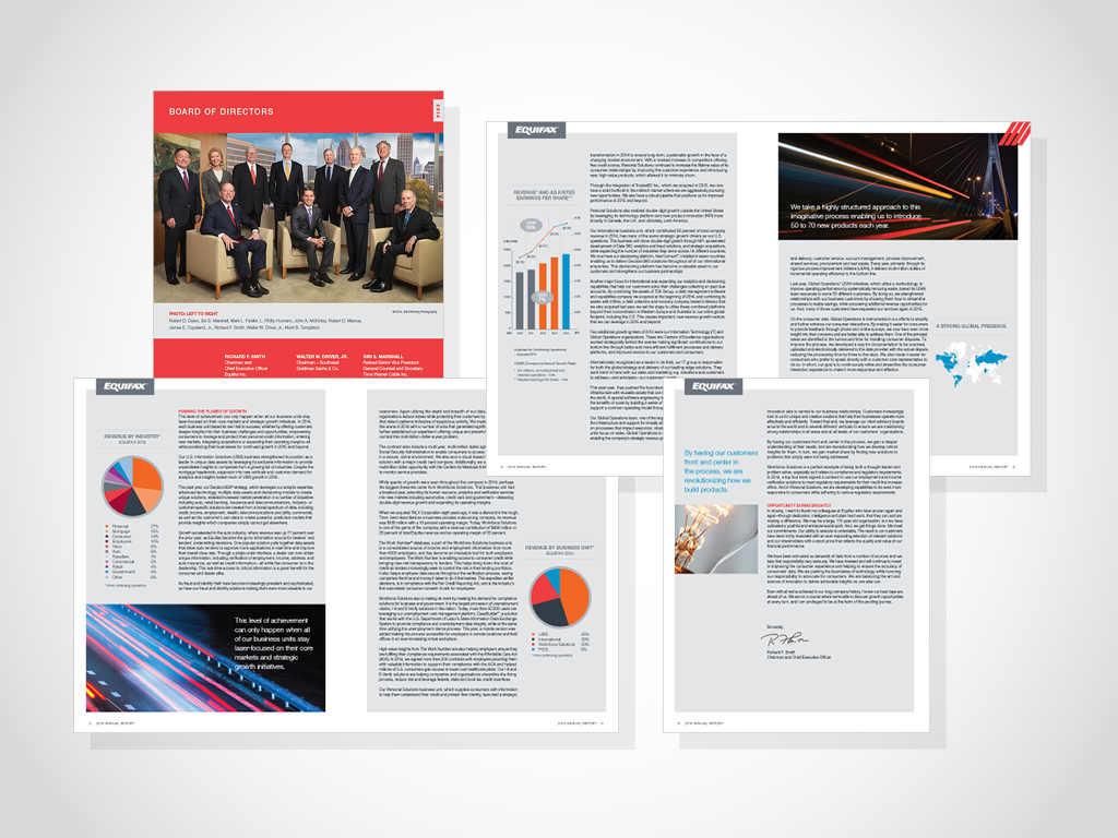
Annual Report
Created for the 2014 year, this annual report elevated the level of design within the enterprise. I worked directly with senior leadership on development of the theme, and “Ignite Growth” was the direction chosen. I managed the versioning for the eight-page shareholder letter and provided visual comps. Furthermore, I gave templates and guidance to our third-party vendor, providing a solid foundation for the financial index pages. For the first time, the artwork and system was also used on the proxy statement. This delivered a stronger visual connection and brand consistency with shareholders. Role Included: Theme Concept, Design and Production Board...
more -
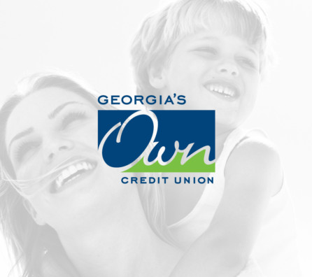
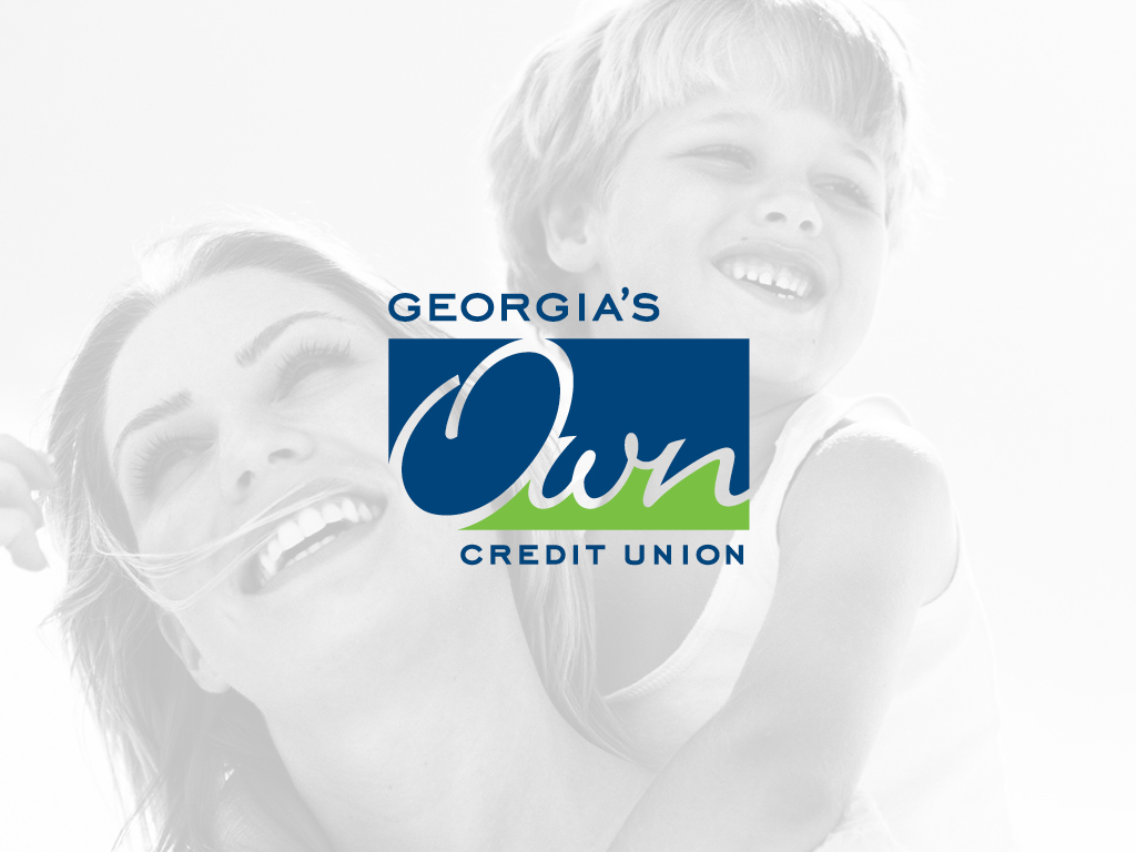
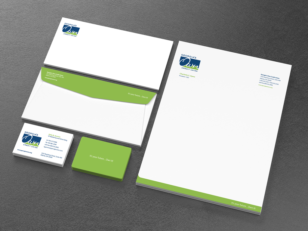
Georgia’s Own
Hired after efforts with a large branding agency were not yielding the desired result. I was tasked with helping to advance the brand evolution of Georgia Telco into Georgia’s Own Credit Union. We identified that the mark needed to be clean and easily recognizable, while also being adaptable to expand into other markets. This was solved by keeping the state name unobstructed, making it interchangeable with another state, for example Florida’s Own. To give the sense of personalization, a script treatment was used in the logo. And finally, with the goal of empowering it’s members, we agreed upon adding the...
more -
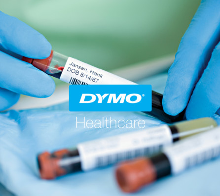
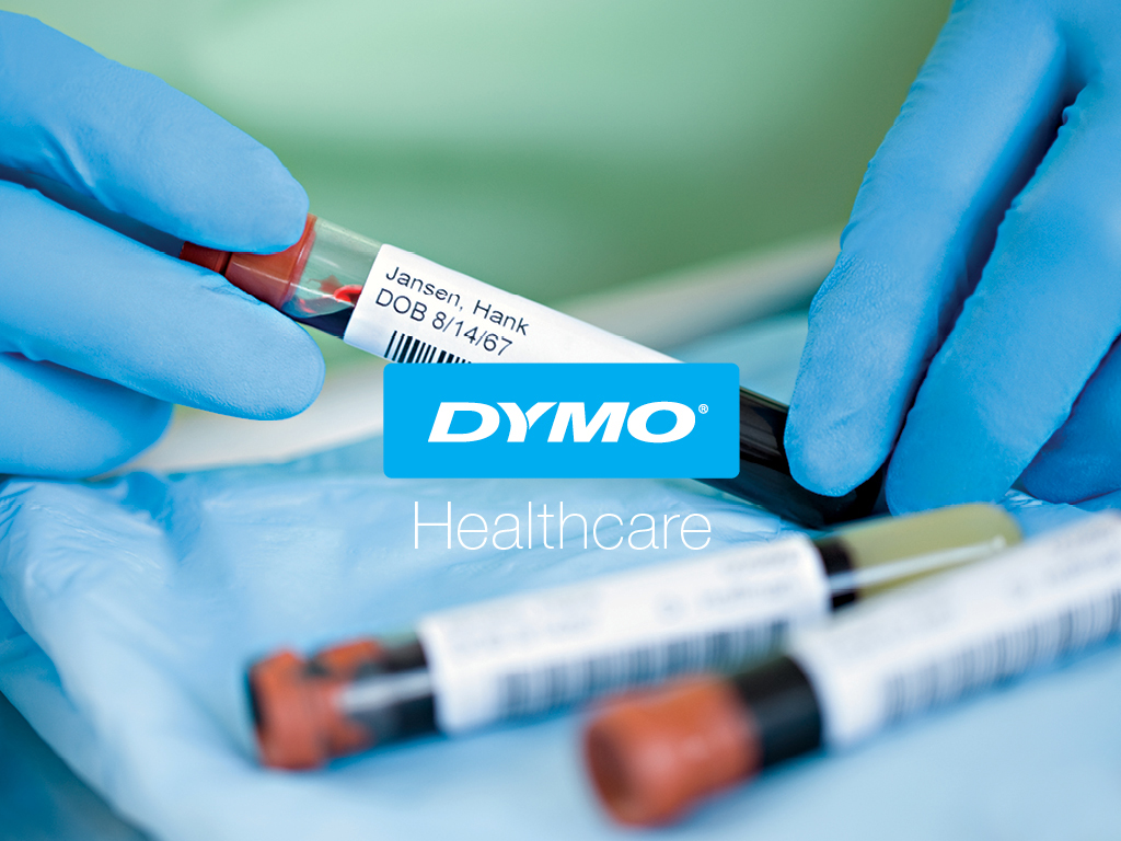
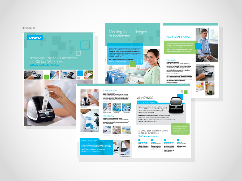
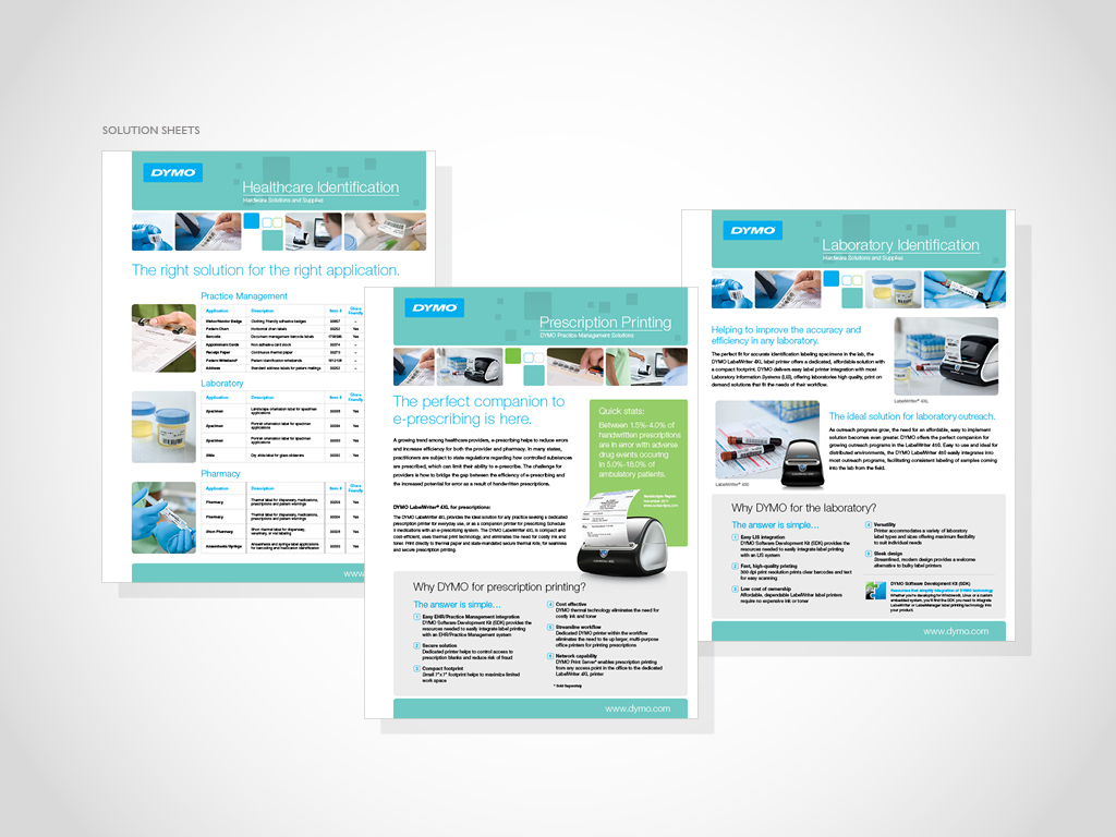
Dymo Healthcare
In partnering with Rubbermaid Medical, Dymo labeling was able to gain credible access into the healthcare space. As our competitor dominated the category; we targeted smaller groups like: practice management, laboratory, and clinical workflow for out-patient care. By simply tailoring our label offering, providing integration and support, and bundling products with Rubbermaid Medical, we could now compete for market-share. I was called upon to enhance our brand standards and color palette to visually align with the segment. I created collateral and tradeshow graphics to support the sales team. In addition, I was responsible for photoshoots; providing industry research, application scenarios,...
more -
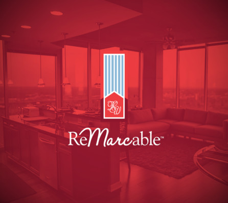
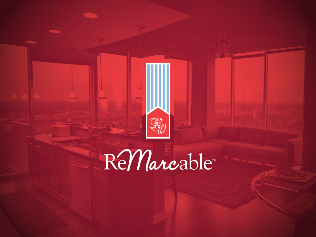
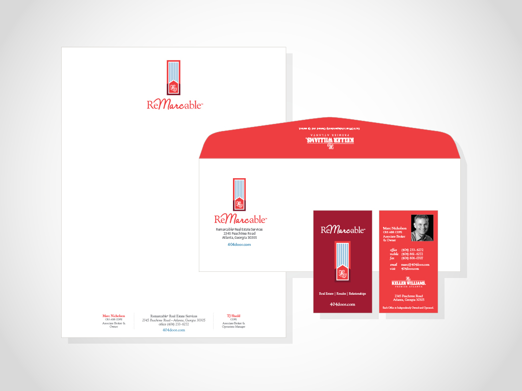
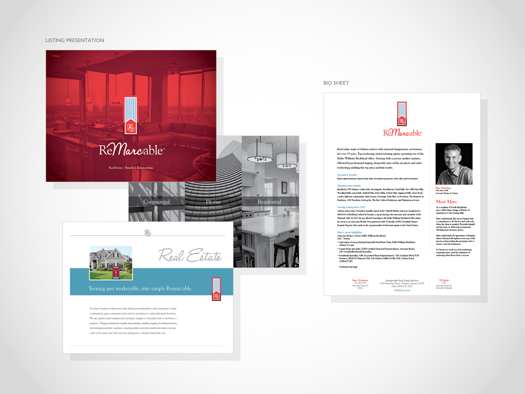
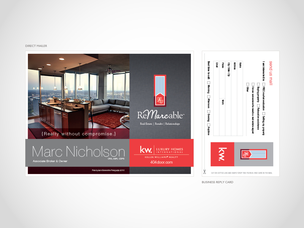
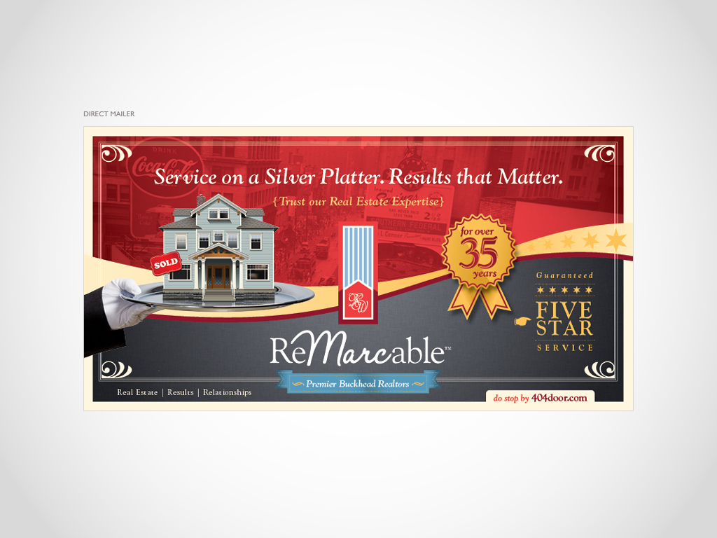
Remarcable Real Estate
A seasoned associate broker & partner in the Atlanta real estate industry, Marc Nicholson is one who stands out in a crowd. I have helped Marc’s craft his identity, branding, and messaging for well over a decade. Originally labeled as Mr. Hi-rise; we worked together to broaden his imprint, and gain traction in the residential and commercial space. Service is something Marc and his team take great pride in, resulting in long-term valued relationships. Marc’s branding is a nod back to those nostalgic times when service meant something. His logo reflects a simple car emblem of the 60’s, and subtly...
more